前言
最近在忙着做光电竞赛的项目。为了实现手机端对数据的访问,我重新拾起年初做的那一个微信小程序,在该小程序的基础上添加了部分新功能。我们最初设想的功能是物联网开发,利用传感器采集温度数据并上传至服务器,再通过小程序读取数据库中的数据,绘制温度变化曲线。前面数据采集这一部分交给了同学去做,我负责的是小程序这一部分内容。
我构思的小程序功能是,第一个页面展示近一周的温度变化曲线,再添加一个按钮,跳转到另一个页面展示全部数据。由于目前硬件设备尚未开发,所以我利用原先的小程序当中的「家庭记账本」中的添加「添加收支」页面,对其进行改写,做了个添加新数据的功能,能够任意添加或删除数据。目前数据库采用的是小程序云开发默认的数据库。
ECharts 是一个纯 Javascript 的图表库,提供直观,生动,可交互,可个性化定制的数据可视化图表。为了在小程序中实现数据可视化,ECharts 是一个不错的选择。幸运的是,目前有一个微信小程序版 ECharts 库可以直接使用:
ECharts 的微信小程序版本
JavaScript
根据静态数据绘制图像
首先将该仓库下载下来,将仓库中的 ec-canvas 文件夹存放在和 app.js 同级的目录下。我要将 ECarts 插入到 temperature-list 页面中,所以在 temperature-list.json 中引入该组件:
1
2
3
4
5
| {
"usingComponents": {
"ec-canvas": "../../ec-canvas/ec-canvas"
}
}
|
我想要实现的是绘制温度变化曲线,在仓库所给的示例程序中,有一个名为在 line 的例程,这一例程正好达到了我的要求,所以可以参考该例程进行编写。在 temperature-list.wxml 中添加 ECharts 图表。
1
2
3
| <view class="container">
<ec-canvas id="mychart-dom-line" canvas-id="mychart-line" ec="{{ ec }}"></ec-canvas>
</view>
|
然后在 temperature-list.wxss 中添加下面的代码:
 1
 2
 3
 4
 5
 6
 7
 8
 9
10
11
12
13
14
15
16
17
18
19
20
21
22
23
24
25
26
27
28
29
30
| /* pages/temperature-list/temperature-list.wxss */
page {
background-color: #f7f7f7;
}
ec-canvas {
width: 100%;
height: 100%;
}
ec-canvas {
width: 100%;
height: 100%;
}
.container {
position: absolute;
top: 0;
bottom: 0;
left: 0;
right: 0;
display: flex;
flex-direction: column;
align-items: center;
justify-content: space-between;
box-sizing: border-box;
}
.picker-pos {
margin-top: -130rpx;
margin-left: 150rpx;
color: blueviolet;
}
|
最后在 temperature-list.js 中添加:
 1
 2
 3
 4
 5
 6
 7
 8
 9
10
11
12
13
14
15
16
17
18
19
20
21
22
23
24
25
26
27
28
29
30
31
32
33
34
35
36
37
38
39
40
41
42
43
44
45
46
47
48
49
50
51
52
53
54
55
56
57
58
59
60
61
62
63
64
| // pages/temperature-list/temperature-list.js
var echarts = require("../../ec-canvas/echarts.js");
const app = getApp();
function initChart(canvas, width, height, dpr) {
const chart = echarts.init(canvas, null, {
width: width,
height: height,
devicePixelRatio: dpr // new
});
canvas.setChart(chart);
var option = {
title: {
text: '近七日温度统计',
left: 'center'
},
color: ["#37A2DA"],
grid: {
containLabel: true
},
tooltip: {
show: true,
trigger: 'axis'
},
xAxis: {
type: 'category',
boundaryGap: false,
data: ['2020-07-05', '2020-07-06', '2020-07-07', '2020-07-08', '2020-07-09', '2020-07-10', '2020-07-11'],
// show: false
},
yAxis: {
x: 'center',
min: 36,
max: 37,
type: 'value',
splitLine: {
lineStyle: {
type: 'dashed'
}
}
// show: false
},
series: [{
name: 'GuanQirui',
type: 'line',
smooth: true,
data: [36.6, 36.2, 36.5, 36.5, 36.5, 36.5, 36.5]
}]
};
chart.setOption(option);
return chart;
}
Page({
data: {
ec: {
onInit: initChart
}
}
})
|
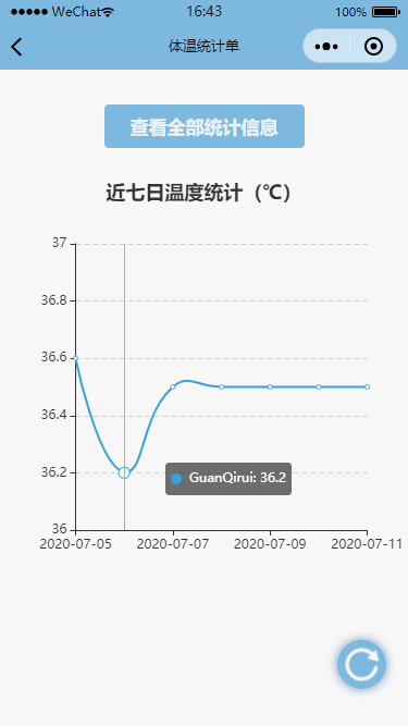
编译后即可看到绘制的曲线图。
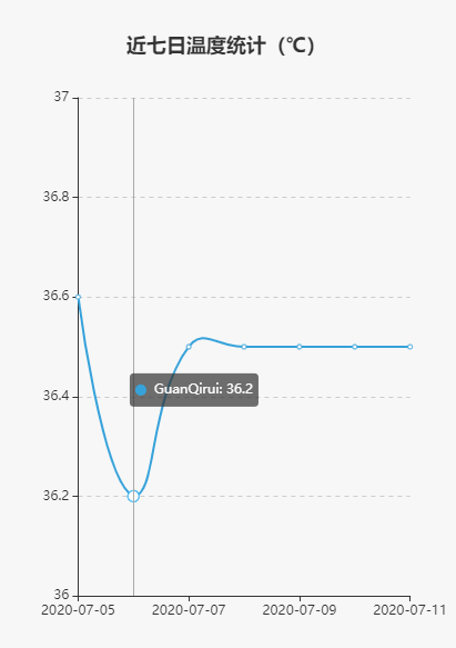 ◎ 绘制的曲线
不过目前我使用的数据是静态的,直接存储在代码中,并不能够修改,也就无法根据实时数据绘制曲线。为了实现该功能,和「家庭记账本」一样,我使用到了小程序的云开发。这里我创建了一个名为 temp 的集合,存储在这里的每一条记录,都需要包含姓名、温度、位置、日期这四个元素。
将数据上传至数据库
我在显示温度变化曲线的页面添加一个按钮,点击能够跳转查看全部统计信息,点击右下角的加号按钮就能够添加新的数据到数据库中。这一部分功能的实现可以参考我之前的那一篇文章——《微信小程序课程后记》,和「家庭记账本」的功能类似,这里不再赘述。
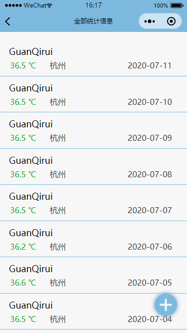 ◎ 全部统计信息
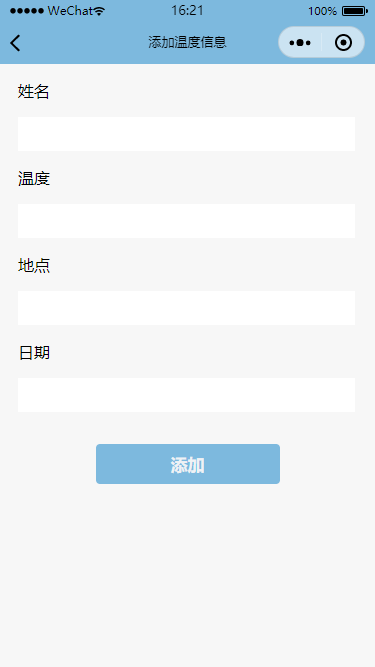 ◎ 添加新数据
我们利用添加新数据的功能向数据库添加了几组新的数据。
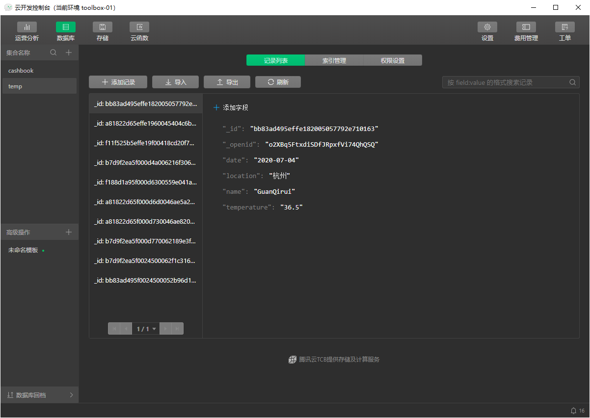 ◎ 数据库页面
根据动态数据绘制图像
接下来就是最为关键的部分——如何载入这些数据并绘制曲线。
观察绘图的函数可知,绘图需要的变量只有三个——姓名、温度、日期。因此可以创建三个数组(name、temperature、date)存放这三组数据。然后在 option 中将原来的数组替换为现在的数组。
从数据库获取数据很简单,如下所示:
 1
 2
 3
 4
 5
 6
 7
 8
 9
10
11
12
13
14
| const db = wx.cloud.database();
db.collection('temp').get({
success: res => {
name = [];
date = [];
temperature = [];
res.data.reverse();
name.push(res.data[0].name);
for(var i=6; i>=0; i--) {
date.push(res.data[i].date);
temperature.push(res.data[i].temperature);
}
}
});
|
如果你直接按照这种方法,对上面的程序进行改写,编译后可以发现图像并没有出来,是一个只有坐标轴的空白图像。虽然我们获取到了数据库中的数据,但是图像并没有更新。所以我们需要设置图像为懒加载(lazyLoad: true),并在页面加载的时候载入数据,再绘制图像。完整的代码如下所示:
  1
  2
  3
  4
  5
  6
  7
  8
  9
 10
 11
 12
 13
 14
 15
 16
 17
 18
 19
 20
 21
 22
 23
 24
 25
 26
 27
 28
 29
 30
 31
 32
 33
 34
 35
 36
 37
 38
 39
 40
 41
 42
 43
 44
 45
 46
 47
 48
 49
 50
 51
 52
 53
 54
 55
 56
 57
 58
 59
 60
 61
 62
 63
 64
 65
 66
 67
 68
 69
 70
 71
 72
 73
 74
 75
 76
 77
 78
 79
 80
 81
 82
 83
 84
 85
 86
 87
 88
 89
 90
 91
 92
 93
 94
 95
 96
 97
 98
 99
100
101
102
103
104
105
106
107
108
109
110
111
112
113
114
115
116
117
118
119
120
121
122
123
| // pages/temperature-list/temperature-list.js
var echarts = require("../../ec-canvas/echarts.js");
var name = [];
var date = [];
var temperature = [];
var Chart = null;
Page({
data: {
ec: {
lazyLoad: true
},
temp: [],
},
seeDetail: function () {
setTimeout(function () {
wx.navigateTo({
url: '/pages/temperature-list-detail/temperature-list-detail',
})
}, 50)
},
onLoad: function (options) {
this.echartsComponnet = this.selectComponent('#mychart-dom-line');
this.getData(); // 获取数据
},
getData: function () {
// 如果是第一次绘制
if (!Chart){
this.init_echarts(); // 初始化图表
}else{
this.setOption(Chart); // 更新数据
}
// 从数据库获取数据
const db = wx.cloud.database();
db.collection('temp').get({
success: res => {
name = [];
date = [];
temperature = [];
res.data.reverse();
name.push(res.data[0].name);
if (res.data.length < 7) {
for(var i=res.data.length-1; i>=0; i--) {
date.push(res.data[i].date);
temperature.push(res.data[i].temperature);
}
} else {
for(var i=6; i>=0; i--) {
date.push(res.data[i].date);
temperature.push(res.data[i].temperature);
}
}
this.init_echarts();
}
});
},
// 初始化图表
init_echarts: function () {
this.echartsComponnet.init((canvas, width, height) => {
// 初始化图表
Chart = echarts.init(canvas, null, {
width: width,
height: height
});
this.setOption(Chart);
// 注意这里一定要返回 chart 实例,否则会影响事件处理等
return Chart;
});
},
setOption: function (Chart) {
Chart.clear(); // 清除
Chart.setOption(this.getOption()); //获取新数据
},
getOption: function () {
// 指定图表的配置项和数据
var option = {
title: {
text: '近七日温度统计(℃)',
left: 'center'
},
color: ["#37A2DA"],
grid: {
containLabel: true
},
tooltip: {
show: true,
trigger: 'axis'
},
xAxis: {
type: 'category',
boundaryGap: false,
data: date,
},
yAxis: {
x: 'center',
min: 36,
max: 37,
type: 'value',
splitLine: {
lineStyle: {
type: 'dashed'
}
}
},
series: [{
name: name,
type: 'line',
smooth: true,
data: temperature,
}]
};
return option;
}
})
|
如果在绘制完图像后,再添加新的数据,那么当前图像页面需要刷新才能显示新的数据。因此我还添加了一个刷新(refresh)按钮:
 1
 2
 3
 4
 5
 6
 7
 8
 9
10
11
12
13
14
15
16
17
18
19
20
21
22
23
24
25
| // 刷新数据
refresh: function () {
const db = wx.cloud.database();
db.collection('temp').get({
success: res => {
name = [];
date = [];
temperature = [];
res.data.reverse();
name.push(res.data[0].name);
if (res.data.length < 7) {
for(var i=res.data.length-1; i>=0; i--) {
date.push(res.data[i].date);
temperature.push(res.data[i].temperature);
}
} else {
for(var i=6; i>=0; i--) {
date.push(res.data[i].date);
temperature.push(res.data[i].temperature);
}
}
this.init_echarts();
}
});
}
|
完整的页面如下图所示。